Our Refreshed Logo
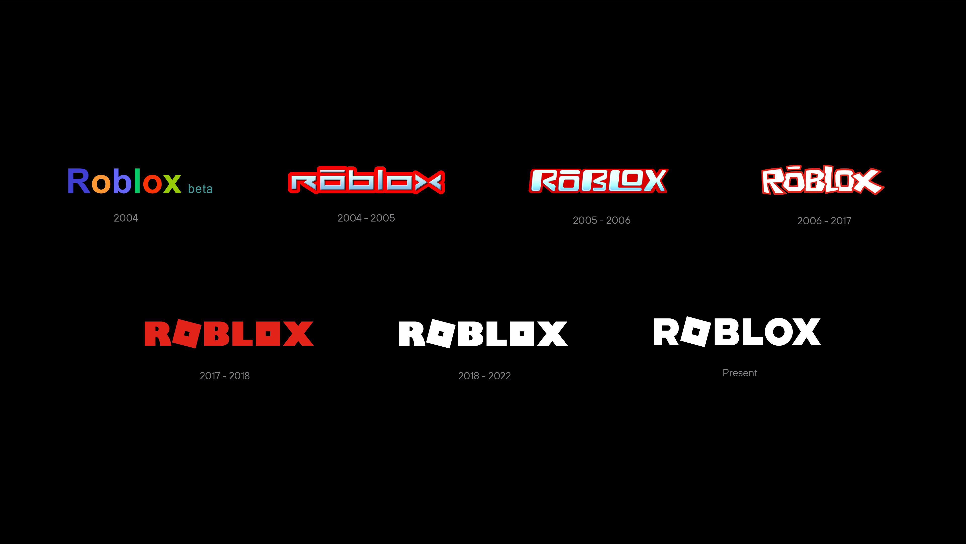
We’ve recently updated the Roblox logo. As we continue to build a platform of 3D immersive experiences focused on reimagining the way people come together, we wanted the Roblox logo to reflect our vision.

The Roblox logo currently has distinctiveness with its tilt – which represents building, progression, and motion. In refining the logo, we wanted to retain the equity of the tilt while also reflecting the evolution of our platform.
Our updated logo introduces new custom letterforms that are lighter in weight and reflect a more modern aesthetic. The second “o” has returned as a letter, giving more focus to our iconic tilt. The tilt has been slightly refined but continues to maintain its distinct character.
As you look at how the Roblox logo has evolved over time, it’s always been aligned to who we’ve been as a company. I’m excited for this new iteration of the Roblox wordmark to reflect our ambition to be a human co-experience platform for all ages and our mission to bring optimism and civility to over a billion people.
